
One sentence in. A whole brand kit out.
Describe what you are building and get real editable vector marks — not traced bitmaps.
Logo variants, the full favicon set, colour palette and paste-ready markup, packed into one zip.
Included in the zip: favicon.ico · icon.svg · apple-touch-icon · PWA icons · OG image · logo variants · head snippet
What is inside
Everything a website needs on day one — and nothing a print shop would send you instead.
Logo & variants
Horizontal and stacked lockups, the bare symbol, solid black and reversed white. Transparent PNG plus infinitely scalable SVG, ready for light and dark modes.
Website favicon
A real multi-resolution .ico plus PNGs at every size, apple-touch-icon and PWA icons — including a separate maskable file with the safe zone Android needs.
Colour palette
Primary and supporting colours with HEX/RGB values, ready to paste straight into your Tailwind CSS config.
Type recommendations
A heading and body pairing from free open-source families that match the brand's tone, with CJK fallbacks already in the stack.
Social & sharing images
A 1200×630 OG image, a Twitter card, a separate square WeChat thumbnail, and a 400×400 avatar for every platform.
Paste-ready markup
A head snippet with the icon links, theme-color, OG and Twitter tags — the ones most sites forget until a share renders blank.
Brand kit examples generated by this tool
Not sure how to describe your brand in words? Look at the branding kit examples below, all generated by our AI. Whether you are building a minimal SaaS tool or a playful consumer app, there is a starting point here.
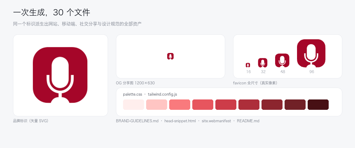
What a finished kit looks like
A real run for a podcast editing tool. One mark, and everything below is derived from it — the favicon at every real pixel size, the OG card, the colour ramp, and the docs that tell a team how to use them.
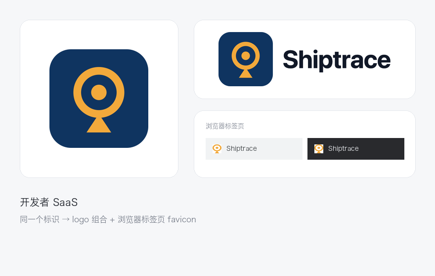
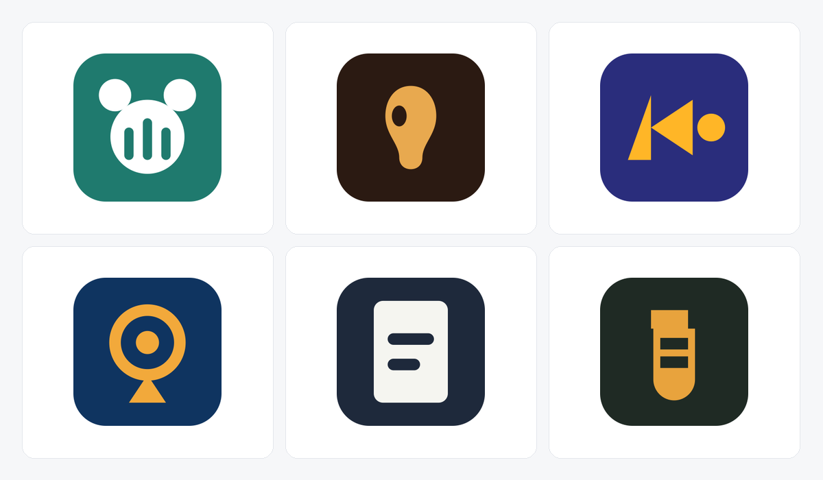
Tech SaaS
"An API monitoring dashboard for developers, minimal and technical, deep navy with a signal accent." The symbol reads as a tracking beacon, and the same mark holds up as a tab favicon.
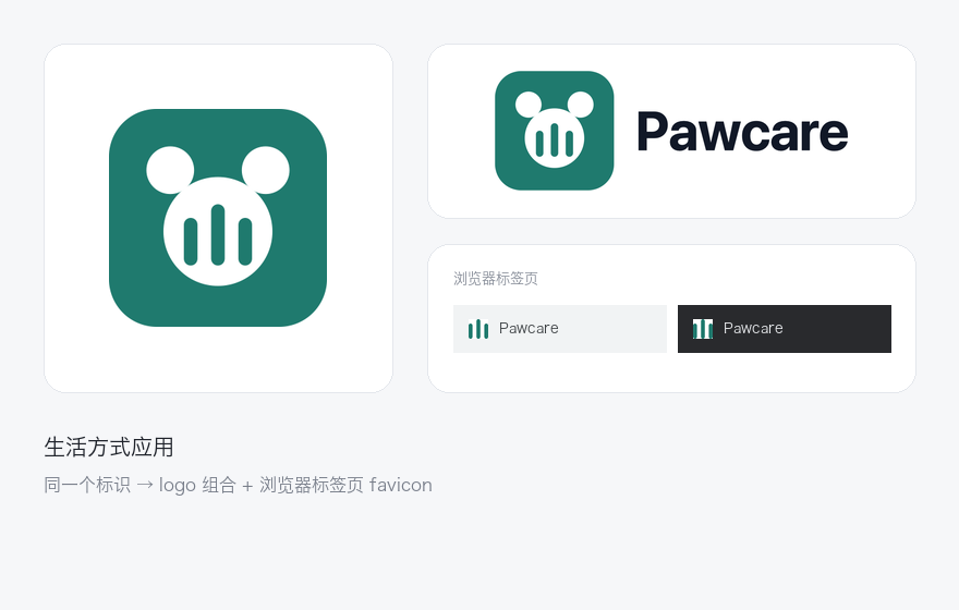
Lifestyle app
"A friendly booking app for veterinary clinics, warm and trustworthy, teal and white." Built from a handful of large circles with generous gaps between them — no hairlines, no small shapes — which is exactly what survives a 16px tab.
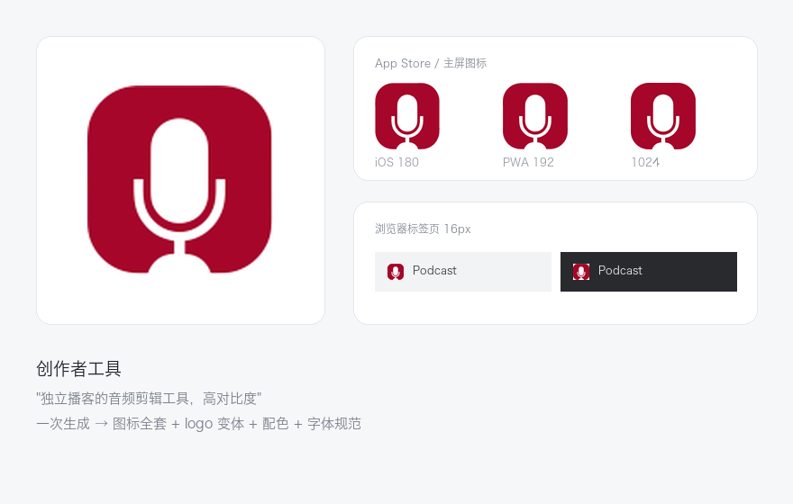
Creator tool
"An audio editing tool for independent podcasters, bold and high-contrast." The play triangle doubles as a wordmark anchor, and the palette stays legible on a dark tab bar.
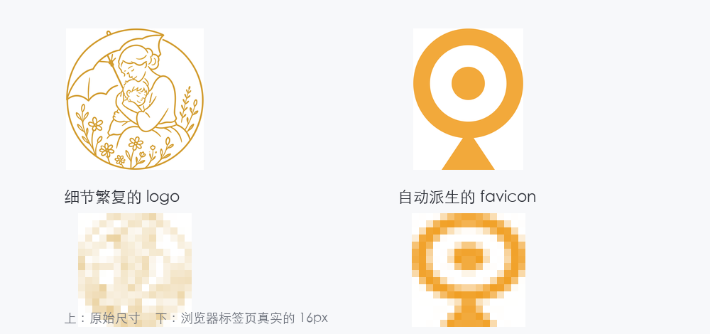
Why the favicon is drawn differently
Left: a detailed logo shrunk straight down to a browser tab — it dissolves. Right: a mark derived under favicon rules, at the same 16px, still legible. This is the check most generators never show you, and it runs on every candidate here.
What is a brand kit, and why is a favicon part of it?
A brand kit is the reusable set of visual assets a product ships with: the logo and its variants, the favicon, the colour palette and the type scale. The favicon belongs in it — but it is derived from the logo's symbol, never shrunk from the whole logo. Google's logo is the four-colour wordmark; its favicon is a single G, drawn separately.
Square, always
Most logos are horizontal lockups. A favicon slot is square, so the symbol has to stand on its own.
Legible at 16px
Thin lines vanish, gradients turn to mud, text is unreadable. This is the constraint that decides the design.
Works on light and dark
A near-white mark disappears in a light tab bar. The palette has to hold on both.
Three steps to a complete brand identity
Traditionally this means briefing a designer and waiting a week. Here it is one sentence and about a minute.
1. Describe your idea
For example: an AI paper-polishing tool for overseas students, minimal tech aesthetic, blue as the primary colour. We turn it into a brand brief and fan it out into several genuinely different design directions — not one idea in four colours.
2. AI generates in parallel
The engine works in parallel: it generates logo concepts as real vector art, extracts the matching palette, and plans the type scale.
3. Download the zip
Happy with it? One click downloads a zip with every asset and the install instructions. Changing the brand name afterwards is free.
FAQ
More questions? Email [email protected].
It is the reusable set of visual assets a product ships with — logo and its variants, favicon, colour palette, type scale, and the usage rules that keep them consistent. A brand kit is not a single logo file; it is everything you need so the brand looks the same in a browser tab, on a phone home screen, and in a shared link preview.
Yes — a handful of paths with named colours, typically under 12KB. It is generated as vector, not traced from a bitmap, so there are no thousand-node outlines to fight with in Illustrator or Figma.
No. The name is a live text element in the SVG, not baked into the artwork, so renaming is a re-render. Only generating new marks costs credits.
You are free to use it commercially. But AI generation cannot guarantee uniqueness — a similar description may produce a similar result for someone else. Consult a trademark attorney before filing.
On purpose. A favicon must be square, must read at 16px, and must hold on both light and dark tab bars. We take the symbol, tighten it to its own bounds, and run a legibility check before shipping it.
Yes. The SVG to ICO converter runs entirely in your browser and is free — no signup and no credits.
Like these styles? Generate your own.
Describe your product and get a complete, commercially usable brand kit packed in about a minute.